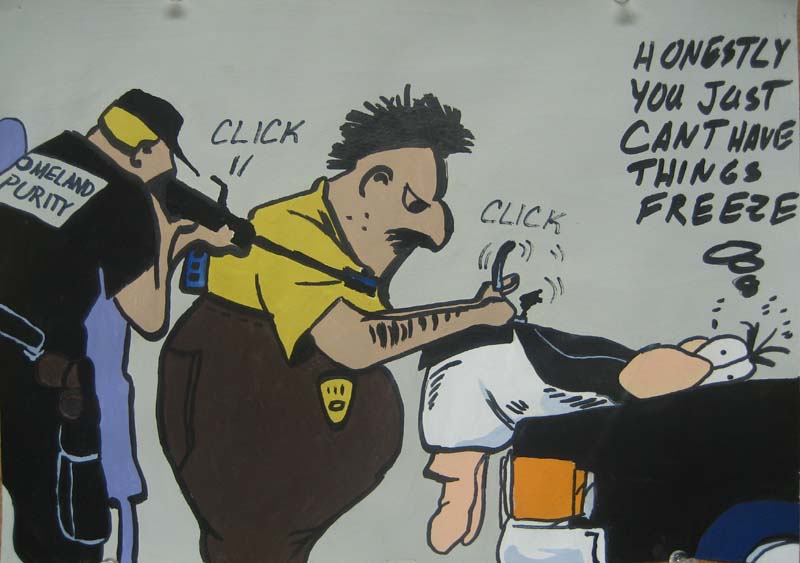
Group Mural

My group's mural addressing the topic of global pollution

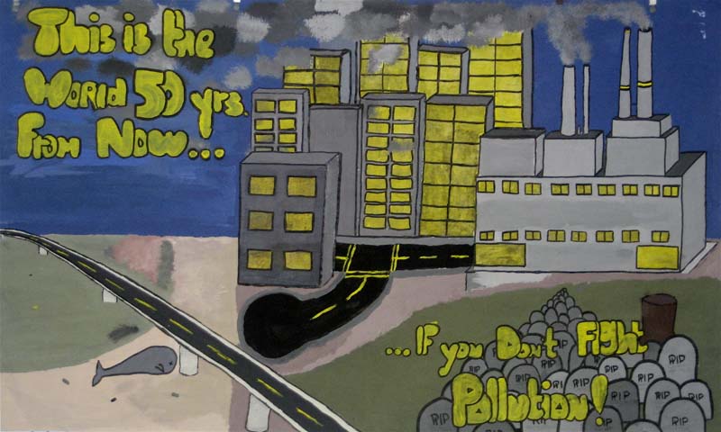
We began the assignment by studying examples of muralism, public art, and styles of composition. After we had a general idea of what to do, we discussed various health cause topics for our murals. Following our choice of a topic, our group sketched a rough draft that we transferred to our final paper. Each mural had to have dominance and emphasis on one or a group of objects. Each mural also had to have elements of rhythm of perspective. After the mural was sketched out, we painted it in using colors to influence the tone of the mural. In this project, I learned about muralism, public art, dominance, perspective, the strength of art, and rhythm.

Standards

  • 1.1: Identify use of design to analyze and discuss aspects of art.
  • 1.4: Analyze and describe how composition is affected by principles of design.
  • 2.1: Solve a visual arts problem that involves the use of the elements of art.
  • 2.6: Create a 2D work of art that addresses a social issue.
  • 4.0: Interpret and speak about the meaning or message in an artwork.

Completed: January 2008

Comic Enlargement

An enlarged version of an Opus comic

First we started by learning how to properly mix colors. After that, we learned each of the primary, secondary, and tertiary colors. We mixed the colors and created our own color whells. When we had successfully created a proper color wheel, we learned how to change the value by adding white, and to change the intensity by adding opposite colors. Next we learned how to use math to enlarge an image without distortion. Using proportions we enlarged the image anywhere from 4 to 7 times. Next, we enlarged a quarter inch grid drawn on to the comic by the determined ratio and copied it to the final paper. After we double-checked the grid,we transferred the comic image to the final paper and doubled up the lines, to create a color buffer. Finally we used our color knowledge to match the colors exactly to the comic. When the paint dried, we used black marker to trace over what was left of the lines. I learned the difference between a variety of words that at one point I had thought were the same. This project also taught me how to properly mix and use the paints. Another fringe benefit is that it helped me to greatly improve my painting skill and methods.

Standards

  • 2.1: Solve a visual arts problem that involves the use of the elements of art.
  • 2.2: Prepare a protfolio of original 2D works of art that reflect refined craftsmanship and technical skills.

Completed: February 2008

CityScape

A pencil sketch of my concept of the London during the Blitzkrieg

First, we learned about linear perspective. Then we learned about vanishing points, horizon lines, and other aspects of linear perspective. When we fully grasped the concepts of receeding lines, we began to draw it, taking care to erase all unnecessary lines and drawing lightly. When we were finished drawing we learned about shading and atmospheric perspective. We used our newly learned knowledge of shading to properly apply gradients of pencil to illuse three dimensions. This project taught me how to properly use atmospheric perspective and shading to create highly realistic illusions of three dimensions.

Standards

  • 2.1: Solve a visual arts problem that involves the use of the elements of art.
  • 2.2: Prepare a protfolio of original 2D works of art that reflect refined craftsmanship and technical skills.
  • 2.4: Review and refine drawing skills.
  • 4.4: Discuss, refine and rework your art.
  • 4.5: Use art criticism in speaking about art.

Completed: April 2008

Famous Artist Project

A radial design which illustrates an artists last name, in this case, Wright

For this project, we first watched a presentation about various famous artists in order to familiarize ourselves with them. When we had chosen an artist we wished to study and follow through on, we conducted additional in-depth research on the artist we chose and wrote an extensive research essay discussing the artist's life, style, and era. For our radial design, we first learned the correct technique to shade and blend different colors, and also the difference between warm and cool colors. Next, we used a final paper to sketch a nine inch square. This square was divided into eight wedges. One wedge was slightly darkened permitting tracing onto a piece of newsprint. On this newsprint, we practiced several different styles with which to illustrate our artist's name. After this design was finalized, generous amounts of graphite were applied onto the design's lines then transferred onto the final paper using a pencil point. The design was colored according to positive and negative space to be aesthetically appealing. To sum up the results of our knowledge, we created a PowerPoint Presentation to present the facts that we learned.

Standards

  • 1.3: Research and analyze an artist and write about the artist's style and movement.
  • 2.1: Solve a visual arts problem that involves the use of the elements of art.
  • 2.2: Prepare a protfolio of original 2D works of art that reflect refined craftsmanship and technical skills.
  • 3.1: Identify similarities and differences in art of different cultures.
  • 3.3: Identify trends in art and how time, place, and culture influence the art.

Completed: April 2008